

The challenge
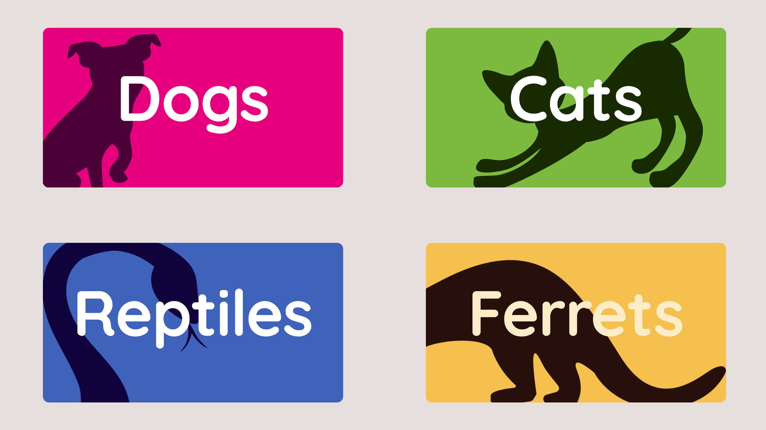
The brand was loved but had outgrown its guidelines. The logo was distinctive and instantly recognisable, but the wider system needed work. Colour combinations were inconsistent, and white text on yellow failed accessibility checks. The typography was clean but neutral, and mixed use of uppercase and lowercase made the tone feel less friendly than the business is. There was no defined illustration style, and the logo only showed cats and dogs in a store that serves many more species. The “Only Good Things” tagline wasn’t doing enough work.

The Approach
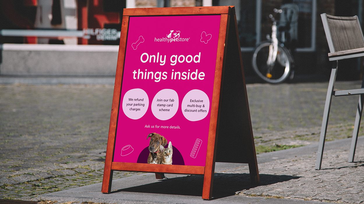
We started with a top-level review of the logo, colour, typography, photography and iconography, then looked at pet retail and food brands for what warmth, simplicity and expertise look like in practice. We built the work around the brand’s four values (choice, simplicity, warmth and knowledge) and its non-judgemental, caregiver-first voice. Our rule was evolution, not overhaul. We kept the logo, kept the core pink, green and yellow, and fixed what wasn’t working. We then showed old and new side by side on real social, in-store and web examples, so the client could see the difference in use.
Our Solution
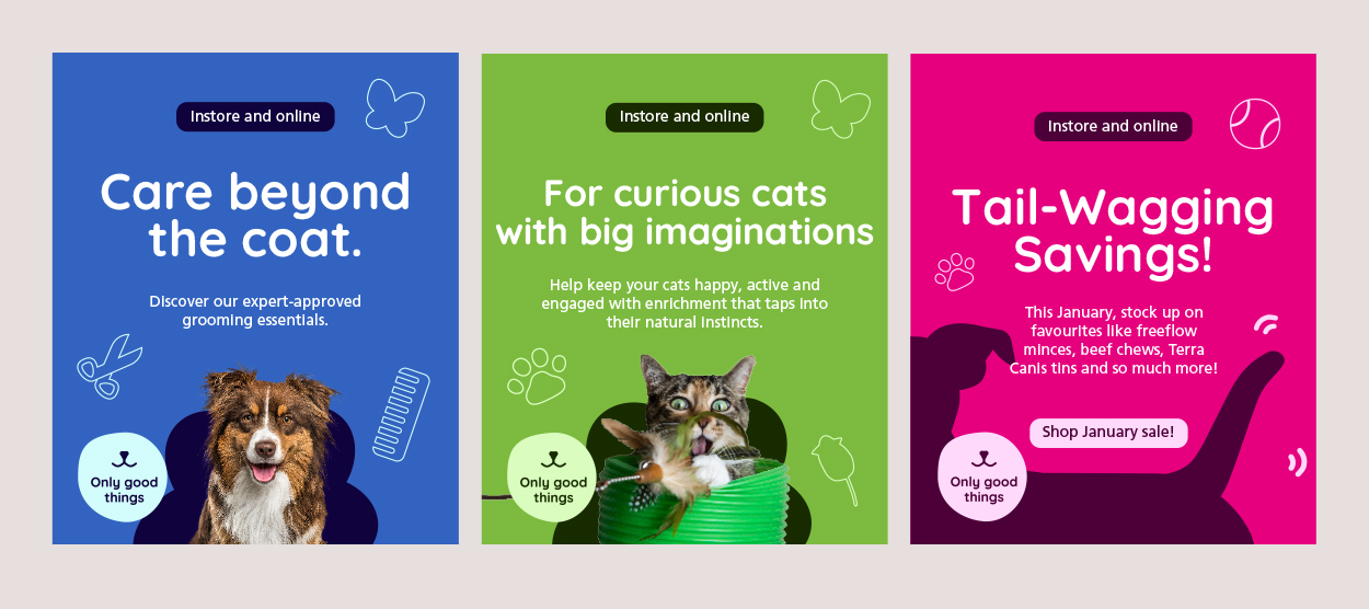
We kept the logo and core colours, then fixed what wasn’t working. A new blue and lighter and darker shades balanced the palette and solved the accessibility issue. Quicksand Bold added warmth to headings, and the logo’s cat and dog characters grew into a wider set of animals. “Only good things” became a stronger, flexible device. It all came together in a full set of brand guidelines, and carried through to the website with a new mega menu.





The results
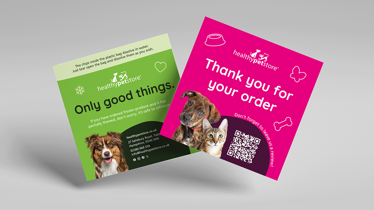
The refreshed brand gave Healthy Pet Store a cohesive, modern look across web, social, in-store and product imagery. The team now has clear guidelines to work from, the brand feels warmer and more consistent wherever customers meet it, and it’s ready to grow with the business as it expands.


